


When planning custom printed aluminum cans, beverage can MOQ is not determined by can volume alone. The number of independent artworks, the stability of each design, the can format, and the expected expansion of the beverage range can all affect how the printing project should be structured.
A beverage range using one stable design is very different from another range using the same can format for several flavors, seasonal editions, or regional versions. Even when the physical cans are identical, the artwork structure may create completely different printing requirements.
For this reason, printing should be planned in the following order:Can Format → Product Versions → Artwork Structure → Design Lifecycle → Decoration Method
This sequence helps prevent a common problem: choosing a printing method first and then trying to make every future product version fit that decision.
Why Beverage Can MOQ Should Be Considered by Artwork Structure
For custom printed aluminum cans, the total number of cans does not fully describe the printing project. What matters just as much is how many separate designs are included.
Consider a 330ml Sleek beverage range containing Original, Zero Sugar, Lemon, Berry, and a seasonal version. All five products may use exactly the same can dimensions and can end, but if each version has a different can design, the printing project contains several separate artworks.
Before defining the printing structure, it is therefore useful to establish:
- How many independent artworks are required, rather than simply how many beverage products exist.
- How different the artworks really are, because a flavor-color change is different from a completely redesigned layout.
- Which designs are permanent, and which belong to limited, regional, or seasonal products.
- How frequently the artwork is expected to change, especially when new flavors are still being introduced.
- Whether future products can use the same design system, rather than requiring another completely independent layout.
The key principle is simple:Printing method should follow the structure of the artwork system, not only the total number of cans.
The 5-Layer Beverage Can Artwork Planning Framework
A more reliable way to plan beverage can printing is to review the project through five connected layers.
1. Can Format
Artwork should begin with the actual can specification. A 330ml Standard can and a 330ml Sleek can hold the same nominal volume, but their body proportions are different. The available visual space, graphic proportions, and text arrangement therefore need to follow the actual can format.
If several formats such as Standard, Sleek, or Slim are included in the same range, artwork adaptation should be considered from the beginning rather than after the main design has already been finalized.
2. Artwork Structure
Different flavors do not always need completely independent design systems. A scalable beverage range can retain a fixed brand area, information hierarchy, and general layout while changing selected elements such as flavor color, product name, supporting graphics, or ingredient imagery.
This creates differentiation without turning every new flavor into a completely unrelated packaging project.
3. Design Lifecycle
Core products and short-term editions should not automatically follow the same planning logic. A design expected to remain stable for a long period has different requirements from a seasonal package, event edition, collaboration, or temporary regional version.
Separating these categories early helps avoid building the entire printing system around designs that may only be used briefly.
4. Change Frequency
Some beverage ranges maintain nearly identical packaging for long periods, while others regularly introduce new flavors and visual updates. The more frequently artwork changes, the more important printing flexibility becomes.
A method suitable for one stable artwork may become inconvenient when the same can format needs to support many changing versions.
5. Expansion Plan
Packaging should also consider what comes next. If a 330ml range may later add 250ml or 500ml versions, or if additional flavors are already planned, the existing artwork system should be able to expand without requiring a complete redesign.
This is especially important for brands building a product family rather than a single isolated beverage.
Direct Printing: Best Considered for Stable Artwork Systems
Direct Printing applies the artwork directly to the aluminum can, making the can itself part of the finished visual package. It is particularly suitable for products with established designs and a relatively stable range structure.
Direct Printing is worth considering when:
- Core artwork is expected to remain consistent, rather than being replaced frequently.
- The number of permanent product versions is clearly defined, making artwork management more predictable.
- The same visual design will be used repeatedly, supporting a stable packaging identity.
- The aluminum surface is intended to remain part of the final visual effect, without a separate full-body decoration layer.
- Different capacities follow the same brand system, allowing the design to be adapted while retaining recognizable structure.
The important distinction is that a standardized can does not automatically mean standardized artwork. One 330ml can format used for many unrelated visual designs can still create a complicated printing project.
Shrink Sleeve: Useful When the Can and Visual Version Need More Independence
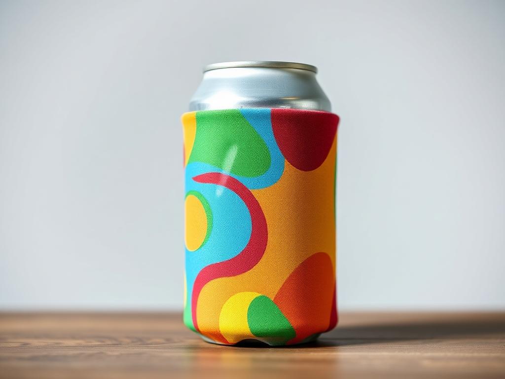
Shrink Sleeve separates the basic aluminum can from the main printed decoration. The graphic is produced on a separate sleeve and then applied around the can, allowing one physical can specification to support different visual versions.
This structure may be useful when:
- several flavors share the same blank can;
- seasonal or regional packaging changes relatively often;
- visual designs require extensive body coverage;
- one base can needs to support multiple external appearances;
- future product versions are expected to continue expanding.
Its main value is flexibility between the physical container and the artwork. It should not automatically be treated as a lower-cost or lower-MOQ option, because the sleeve itself introduces an additional material and application stage.
The better question is whether separating the can from the visual layer makes the overall product range easier to manage.
Digital Printing: Useful When Artwork Changes Frequently
Digital Printing is particularly relevant when packaging designs are still evolving or when one can format needs to support many different visual versions.
Typical situations include:
- new packaging concepts still being tested;
- limited or event-specific designs;
- collaborative editions;
- frequent artwork updates;
- several visual concepts using the same can format.
The main consideration is therefore not simply whether a project is “large” or “small.” A more useful question is:
How stable is the artwork?
A long-term core design and a short-lived promotional design may use the same aluminum can but require very different levels of printing flexibility.
Direct Printing vs Shrink Sleeve vs Digital Printing
| Product Structure | Direction to Consider | Main Reason |
|---|---|---|
| Stable core product with long-term artwork | Direct Printing | Supports a consistent, repeated visual system |
| Several established flavors using one can format | Build a shared artwork system first | Prevents unnecessary design fragmentation |
| One blank can supporting several external appearances | Shrink Sleeve or similar decoration | Separates the base can from individual visual versions |
| Seasonal or temporary packaging | Flexible decoration methods | Better suited to shorter design lifecycles |
| Artwork is still changing frequently | Digital Printing or similar methods | Provides greater flexibility between design versions |
| Several capacities share one brand identity | Create common layout rules | Helps maintain consistency across different can dimensions |
No printing method is universally better. The appropriate choice depends on how the product range itself is structured.
How to Avoid Artwork Fragmentation in a Multi-Flavor Range
Artwork fragmentation occurs when every new flavor or product version introduces a completely different design structure. Over time, the cans may share the same dimensions while the visual system becomes increasingly difficult to maintain.
A more scalable approach is to keep several elements consistent:
- Fix the main brand area, including logo position and key identification elements, so every product remains visibly connected to the same range.
- Maintain a consistent information hierarchy, allowing flavor names, beverage information, and other essential content to appear in predictable locations.
- Use selected elements for differentiation, such as color, ingredient imagery, secondary graphics, or flavor-specific details, instead of redesigning the entire can.
- Separate core designs from temporary editions, allowing seasonal or collaborative packaging to vary without changing the underlying system.
- Develop design rules by can format, so future flavors can be added without recreating the artwork structure from the beginning.
This approach keeps individual products distinctive while making the beverage can range easier to expand.
A Better Order for Planning Custom Printed Aluminum Cans
A common mistake is to choose a printing method before the product architecture is clear. A better sequence is:
- Confirm the Can Format.
Define the capacity, body style, and actual can dimensions that will determine the artwork area. - Map the Product Versions.
Identify core flavors, variations, regional editions, and short-term products. - Build the Artwork Structure.
Decide which elements remain fixed across the range and which elements change between products. - Define the Design Lifecycle.
Separate permanent packaging from frequently changing or temporary versions. - Choose the Decoration Method.
Compare Direct Printing, Shrink Sleeve, Digital Printing, or other approaches only after the first four decisions are clear.
This sequence reduces the risk of creating a printing structure that works for the first product but becomes increasingly difficult to manage as the range grows.
Packfine Custom Printed Aluminum Cans
Packfine offers aluminum beverage cans in different capacities and formats, including Standard, Sleek, and Slim options, allowing the physical can specification to be coordinated with different beverage packaging concepts.
For beverage ranges involving several flavors, capacities, or visual versions, can selection and artwork planning are more effective when treated as one connected system:
Can Size + Can Format + Artwork Structure + Design Lifecycle + Decoration Method
A clear structure at the beginning makes it easier to introduce additional flavors, capacities, and packaging versions later without creating unnecessary design fragmentation.
FAQ
Why does beverage can MOQ vary between projects?
Beverage can MOQ can be influenced by the number of separate artworks, the printing method, can format, design stability, and overall product structure. Identical can dimensions do not necessarily mean identical printing requirements.
Is Direct Printing suitable for a multi-flavor beverage range?
It can be, especially when the different flavors follow a stable and consistent artwork system. Using shared layout rules helps prevent every flavor from becoming a completely independent packaging structure.
What is the main difference between Direct Printing and Shrink Sleeve?
Direct Printing applies the artwork directly to the aluminum can, while Shrink Sleeve uses a separate printed decoration layer around the container. The key difference is how closely the artwork is tied to the physical can.
When should Digital Printing be considered?
Digital Printing can be considered when artwork changes frequently, multiple visual versions need to be tested, or a beverage range contains short-term, limited, or evolving packaging designs.
Post time: Aug-19-2026